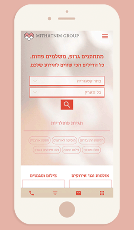
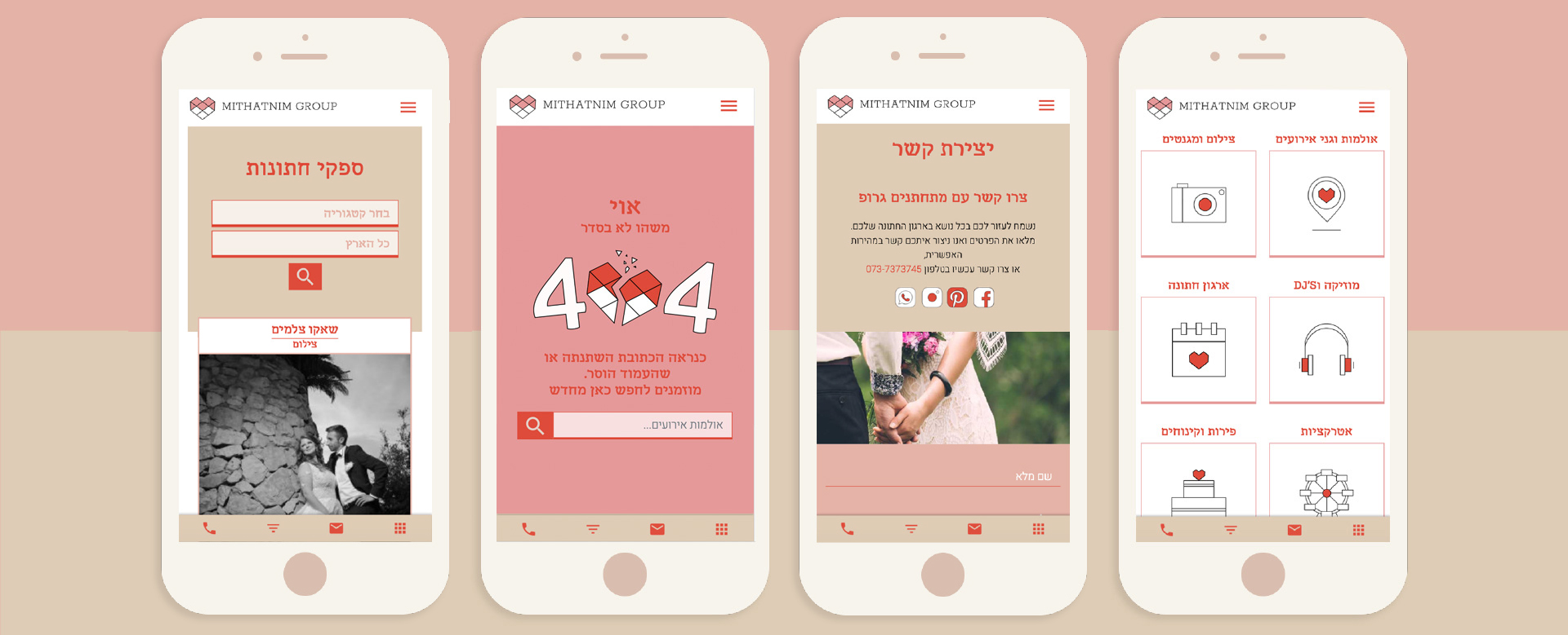
Mithatnim Group

ABOUT

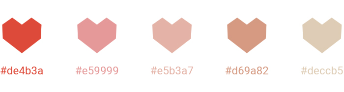
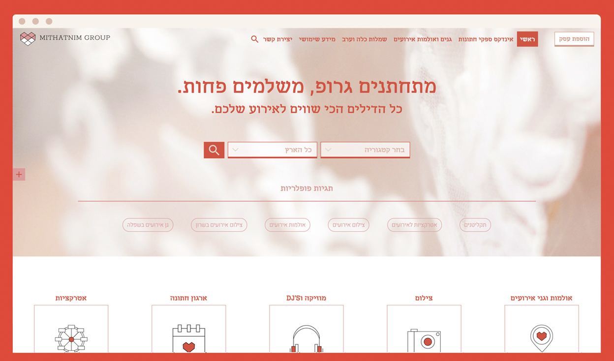
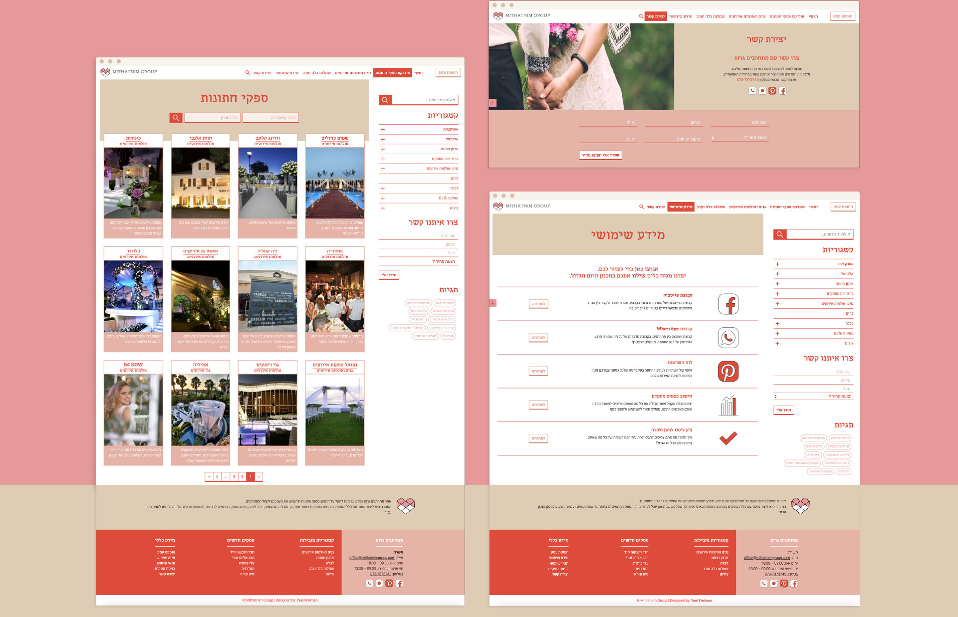
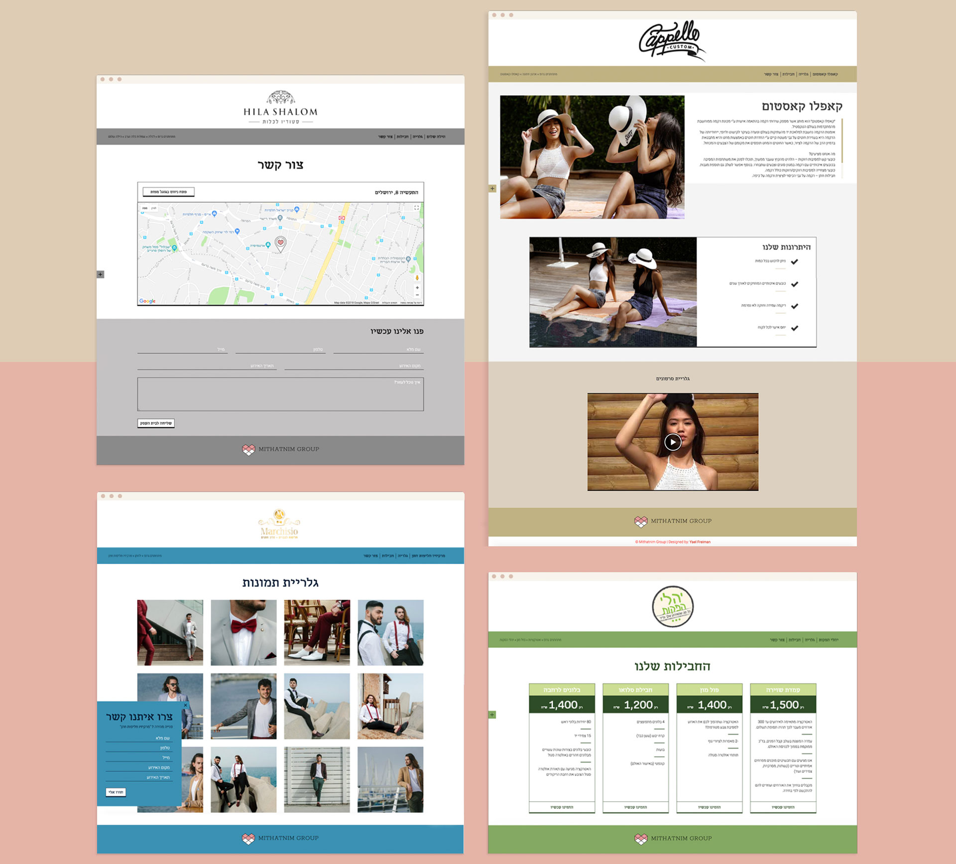
Branding and UX/UI Design for “Mithatnim Group”- A website that includes a variety of suppliers for events. The Branding presents the business as modern and fresh, with natural-pink color palette and a touch of deep orange that brings power to the design.

The development and design process were being created in a corporation with the web developer, and it required a lot of planning and thinking about every little detail.

credits

Fonts:
– Heebo by Oded Ezer.
– Mekomi by AAA.

Developed by: SITEIX

1. Colors

2. Icons Set

Clean, modern and minimalistic design

3. Main Page

Right at the top of the page, users can easily search the supplier they are looking for by using the convenient search form, filters and tags. A contact us form pops out from the left side, and they can also find the supllier by categories. Another search tool is found on the sticky menu.

Play Video

4. Internal Pages

In addition to the main page, pages such as index, information, contact us, articles and more…

5. Internal Suppliers Pages

All suppliers who work with Mithatnim Group receive a website that displays their business, gallery, special packages, and a way to contact their business. Suppliers can choose colors from 4 colors (in addition to the Mithatnim Group’s default palette) palettes to suit their brand language.

6. Responsive Design

In collaboration with the web developer, we have created a user experience in mobile that feels lika an app. At the bottom of the page there are icons that help the user to orient himself and get to the necessary actions quickly.

heart